Study Buddy- UX UI case study

UX/UI Design & Prototyping for an App to find a friend to study with
Mission Statement
Our UX/UI project aims to create a mobile application that connects students in an online social environment, facilitating the scheduling of meetups to study and chat. Our goal is to design an app that offers an easy and enjoyable way for students to connect with each other, discuss academic topics, and make friends. Our app addresses common issues faced by students, such as difficulty in finding study partners or scheduling office hours, while providing a unique and innovative solution that has not been fully explored in the market. Our mission is to enhance the student experience and make learning more social and collaborative.
Interview script and general description of participants
As evaluation is an integral part of the design process, we interviewed a group of students from Carleton University and University of Ottawa to find out about users’ needs in terms of finding a partner to study. All participants are reasonably tech-friendly and are between the age range of 19-24 as this app is built for college going students. We prepared a semi-structured questionnaire to better understand each participants’ attitude, approach and desired outcomes with respect to the app. We asked them the following multiple choice questions-
Answer each question by circling the answer that best represents your view.
Do you prefer to study individually or with a friend/group?
Individually
With a friend
With a group of people
How likely are you to ask a classmate/TA for help when you are struggling?
Very unlikely
Unlikely
Not sure
Likely
Very likely
Do you agree that you gain more knowledge on the topic when you have to work in a group instead of working by yourself?
Strongly Disagree
Disagree
Not sure
Agree
Strongly Agree
How easily do you make friends in class?
Very easily
Takes time
Very difficult
How do you catch up on study material if you miss a class?
Ask professor
Ask random students (if you don’t know anyone)
Ask TAs
Ask friends
(Select more than one if applicable) If you are preparing for a general Test for example G1 test or LSAT etc. , would you -
Study on your own
Find a student preparing for the same
Find a mentor/ person who has given the exam previously
What do you mainly use mobile apps for?
Entertainment/Games
Social media
Learning
What do you look for in an app that makes you use it frequently?
Simplicity of usage
Visual design
Reliability / Security
How likely are you to meet with someone you connected with on a mobile app (in terms of an educational app) ?
Very unlikely
Unlikely
Not sure
Likely
Very likely
In addition to these, we also asked some open ended questions which gave us some more insight into what they thought could improve the app and what functionality they appreciated.
What functions would you need on such an app for it to be useful?
What would be your desired outcome after using this app?
Role-playing scenarios-
i) You have recently moved to a new school and have missed a couple weeks of classes. You also have a doctor’s appointment on the day of the review lecture. What will be your strategy to get notes and do well in school?
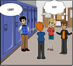
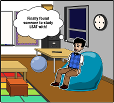
ii) You have just signed up for the LSATs and needs to find out more on how to study for it. As none of your friends are applying for law school, you have to find someone to guide you/ study with you. What will you do?
iii) You work full time and are studying part time. You are much older than anyone in your class. How would you attempt to make friends/ ask for help for an upcoming exam?
personas
Persona 1-
Background:
-19, Female
-Second year engineering student
-Transferred from Queen’s University
Motivations:
-Needs to do well in school
-Needs to work on her social skills
Frustrations:
-New school, living off campus
-Having a hard time making friends in her program
-Needs notes from a class she missed
Persona:
Sophie is a second-year engineering student at Carleton. She just transferred from Queen’s University to live at home due to homesickness. She really cares about her education and hoping to start over at a new institution. Sophie is hoping she will make new friends in her program, before school starts, however, she is shy and not a talkative person. She doesn’t attend frosh week, and living off campus isn’t helping her situation either.
Persona 2-
Background:
-23, Male
-Third year psychology student
- Does not spend much time on campus
Motivations:
-Want to finish degree as soon as possible
Frustrations:
-Works full time, living off campus
-Much older than most people in his course
Persona:
Ben is a recent business student graduate going back to school to pursue his masters. Ben works as a full time marketing associate while going to school part time. With how busy his schedule is he is having trouble making connections at school. He is a hardworking individual who has a strong passion in what he does, he is hoping to meet like minded people to further his learning.
Persona 3-
Background:
-21,Male
-4th year History and English student
-Hard working and intelligent student
-TAs for an English Course
Motivations:
-Wants to get into a good Law school after finishing his degree.
-Likes to help others
Frustrations:
-Do not have anyone to mentor or help in his preparation for LSAT
Persona:
John is a senior at Carleton University pursuing a double degree in History and English. He is very passionate about his studies and is a very focused individual. He wishes to do his further studies in Law and get into a good law school after his degree. He is a very confident person who is not afraid to talk to anyone for help. He has a good rapport with his classmates and professors and is also working as a TA for one of his English classes. He loves to help others and loves working in a group.
Affinity diagram

starting the design—
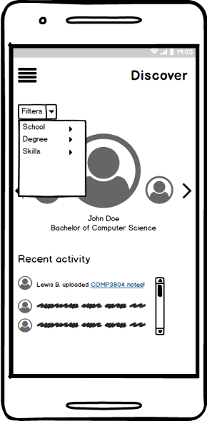
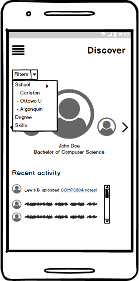
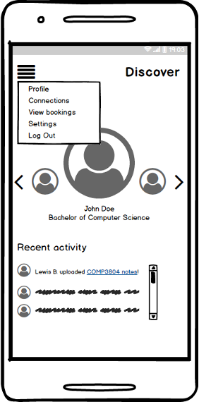
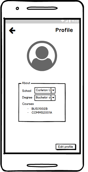
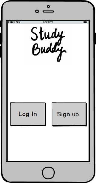
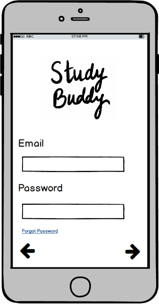
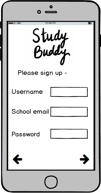
Prototype 1
Design rationale
Design name: Simple centralized flow
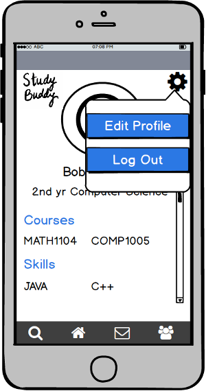
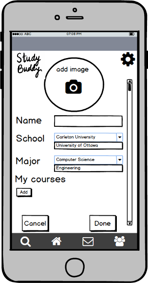
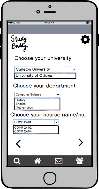
The key characteristics of this design is that it’s easy to use and has self explaining interface. It included multiple filter/sorting options. Each page has relevant information grouped making it easier for the user to navigate through the application. As soon as you are greeted with the home page you are presented with a menu bar and profiles of people in your area, they do not clutter the screen and each button click takes you exactly where it indicates it would. This design was structured around visibility, affordance and consistency. When interviewing users most didn’t like being bombarded with questions upon signup. Instead, now you only need to answer a few key questions and if you want to further filter who you see on the discover page, there is a labeled option to do so. We tried to avoid using text boxes to get user inputs as that would increase the chance of error in input which would effect the matching process of our application. The option to upload notes will be made available, but only to people who are currently “connected” (friends). We discovered that most people didn’t like to email the other students when they miss a class, this will make things easier as when sending an email out you would have to send it to the entire class. Approaching these issues the one thing we kept consistent along the design process was a centralized approach, where the key aspect of the page would be the most outlined element and its related options and information would follow but less focused on. This is called a “Center stage” in terms of a UI pattern. The advantages of this design in relation to our requirements is that it works well with updates, uses its space well and is very user friendly. When future requirements are derived from further interviews/research this design makes it easy to modify elements to adhere to them.
digital wireframes- Prototype 1
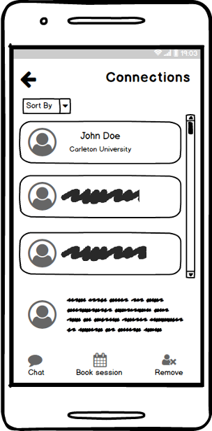
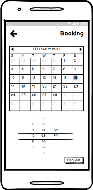
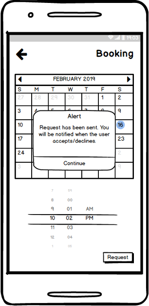
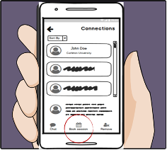
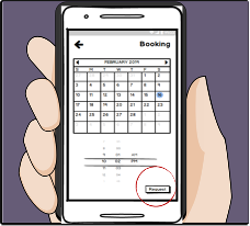
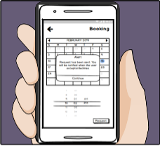
User Storyboard
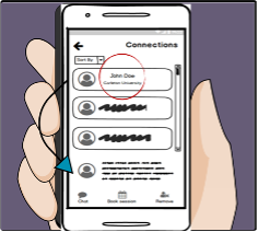
Sunny is planning to take the LSAT and none of his school friends have any experience with it.
He remembers he had an account in study buddy and will easily be able to find someone to study with.
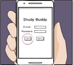
He logs in and
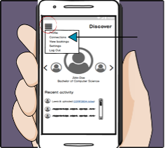
clicks on the menu to see his connections
He sees John and clicks on his profile to see his skills/courses
He then requests to book a session with him and
And 8. gets notified of the same
Prototype 2
Design Rationale
Design name: Simple
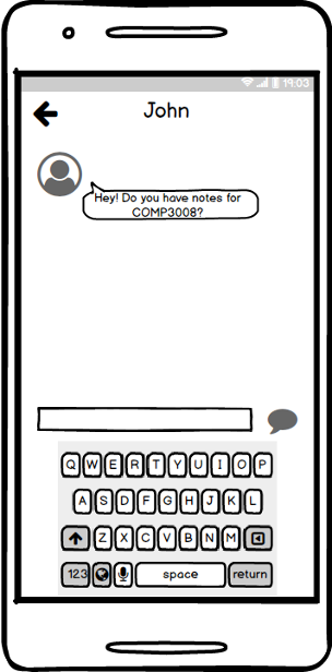
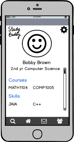
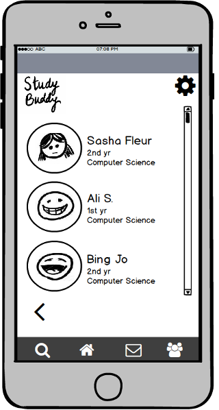
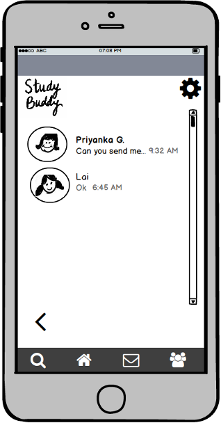
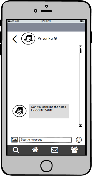
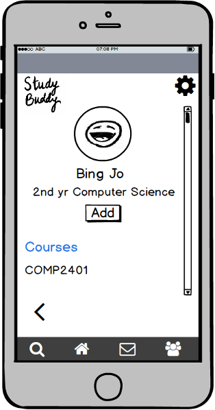
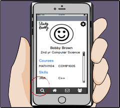
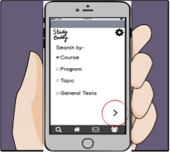
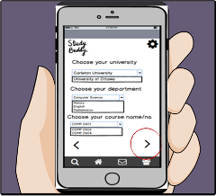
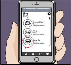
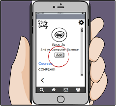
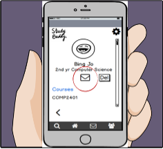
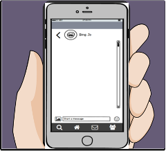
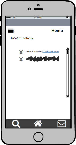
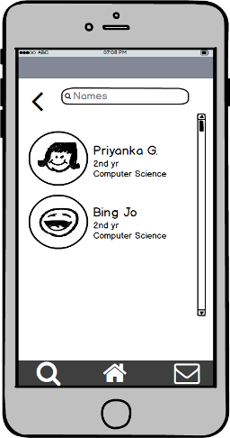
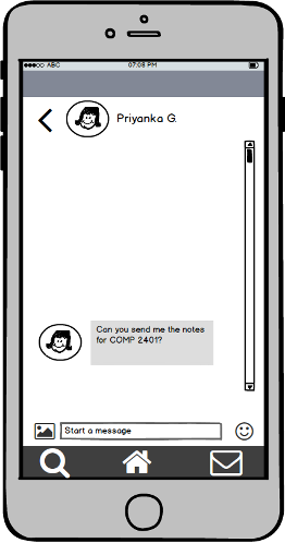
For this design, the key characteristic that can be seen anywhere in the prototype is the simplicity in design. Each screen has been designed with minimum content to avoid confusion and clutter without compromising the functionality of the app. The main purpose of the Study Buddy app is to allow users to find people with similar educational goals and book study sessions for a better learning experience. Therefore, this prototype includes features which support the end goal of the Study App. There is a search engine which allows users to easily search for people by course, program, topic, and general tests. The process has been designed with the least amount of steps to reduce user input. Furthermore, the app allows users to view profiles of people before adding them to their list of study buddies. The user can message their study buddy and book study sessions by messaging them. This has been designed from experience; students usually decide when and where to study through a messaging platforms. The language used throughout the app allows clear communication between the user and the app. All areas of the app; search, home, messages, and study buddies, can be accessed by a menu present at the bottom of each screen. The icons used are familiar, hence the user can use prior experience to navigate across the app.
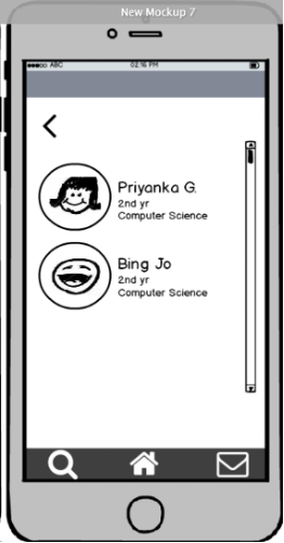
digital wireframes- Prototype 2
User Storyboard
Sarah has just moved to a new school and does not know anyone in her class. She struggles in her course work and wants to find a friend to study with.
Her sister suggests her to use study buddy app so she can easily link with people who take the same class
She signs up with her information
And starts searching
She selects from the options and
Is shown a list of people
She selects one of the profiles
and adds them
/ 10. and starts messaging them for help
11 / 12. She then feels more confident after talking to someone and getting help
Cognitive Walkthrough Summary
Prototype 1 (Michael and Mustapha) walkthrough
This prototype was designed with search, sorting and filtering as central to functionality.
The main page is a discover page where users can filter and sort a list of other users of the app for selection. A menu button in the top right contains most of the other functions like profile settings etc. In this design, noticing the correct action is not quite evident and users have to explore a bit to find actions at the first time of use. Therefore while it is learnable, users might not notice the correct course of action until after a brief trial and error period. However when the actions are performed, evident responses are given by the app to the user in form of alert pop ups that inform of the success or completion of actions. Users are then able to interpret these responses correctly.
Prototype 2 (Geetika and Noor) walkthrough
This prototype was created with ease of use as the main drive in design. Four icons on the bottom tab allow for quick navigation to key components of the app. Each icon is chosen to be generic and instantly recognizable for the app to be quick and easy to learn. A magnifying glass icon represents the search tab which is designed for selection of filters to narrow down search results. A home icon represent the main page of the application. This is made to be the profile of the user. An envelope icon represents the messaging page on the app. The envelope being an almost universal symbol for messaging. The group icon finally represents the friends list tab. Learnability for this design is quite good due to the familiarity of the icons to the users with the exception of the home button which is a profile page. Instead the user presumes the home to contain activities or an event feed rather than the profile of the user. The correct action for tasks is evident to the user due to the simple layout of the design. The uncluttered user interface allows users to quickly see all actions available. However response to actions is subtle although users are still able to interpret them correctly. This design is highly useable with quick and easy navigation and a simple user interface.
Selection of Prototype
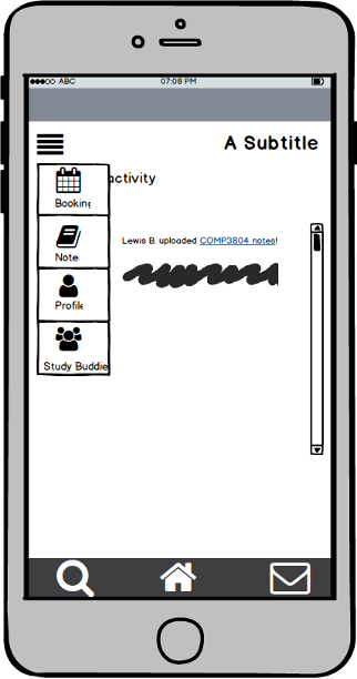
The prototype we selected was prototype 2 for its high learnability and usability with its quick and easy navigation. While it was inferior in response to the user we determined that the intuitive design and familiarity out weighed the responsivity of prototype 1. Thus it served a base for the new prototype. We took the better parts of prototype 1 and add them to this to address the deficiency of prototype 2. The number of tabs in the prototype were reduced from four to three removing less essential tabs for an even cleaner and simpler look. The Home tab was fleshed out so that it no longer displayed the profile. Now the home page contains a Feed that displays recent updates like the activities or status of study buddies and upcoming events, meetings and tests. The menu button on the top left of prototype 1 was also added to it. The menu drops down for navigation to other pages namely; a notes page for sharing to and viewing shared notes from study buddies, a booking page with a calendar for viewing and setting study sessions or meetings. The evident responses from prototype 1 were also implemented into 2. Finally, a text box and filter menu where added to the search tab for more efficient search functionality. With these minor changes we proceed with prototype 2 for the project.
digital wireframes- Selected Prototype
refining the design—
usability studies- round 1
Changes made after the first iteration:
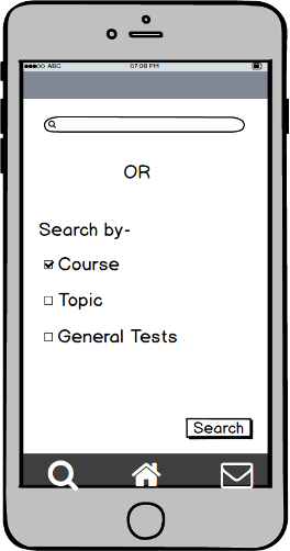
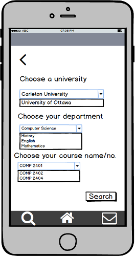
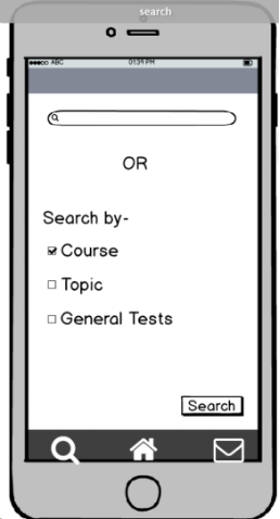
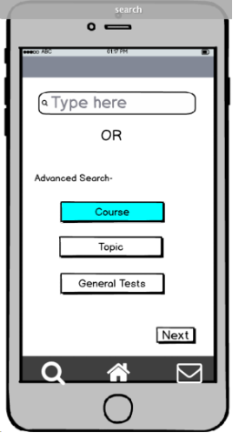
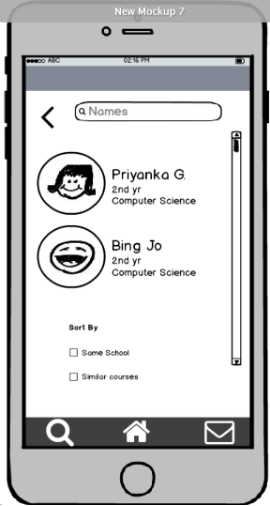
The major areas of changes based off the first round of testing included the search screen which involved a lot of confusion. The two methods of searching; by name or by course, topic or general tests, were not clear. The screen did not look aesthetically pleasing with the checkboxes, and had limited functionality. In order to create a self explanatory screen, “Type here” was added in the search bar, “OR” was used to display an alternative method for searching study buddies, and description of searches were updated. Furthermore, “Search by” was changed to “Advanced search” from the suggestion provided by participant # 1 , and checkboxes were replaced with buttons, where the blue represents the selected button. The search screen shown below will be used for the second round of testing.
Before and After:
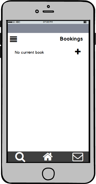
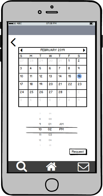
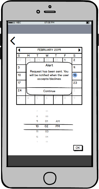
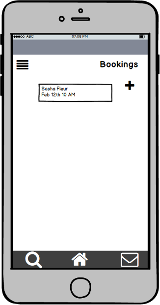
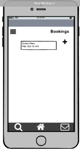
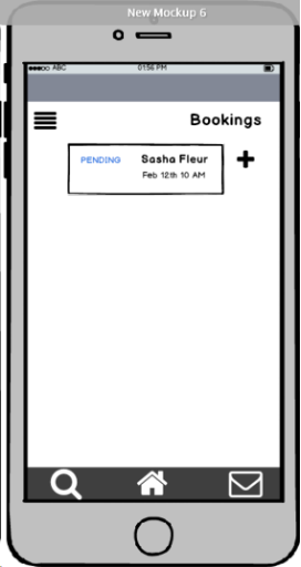
A key feature for the Study Buddy app, is the ability to allow users to make bookings with their study buddies. Some changes that were requested by the participants, were to add a booking option to the chat between people, have “suggested location” as an option when booking appointments and also after requesting a booking, show the pending request in the bookings screen. The bookings screen shown below shows the result of requesting a booking with a study buddy, and this will be used for the second round of testing.
Before and After:
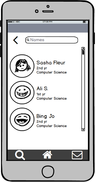
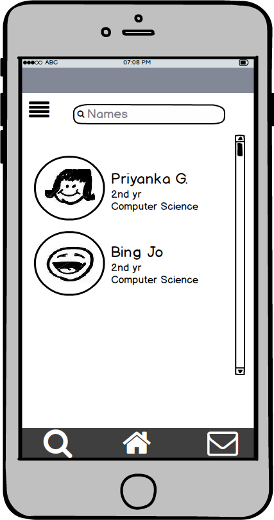
For more functionality, a search bar was added to the top of the study buddies list, which allows users to search for a study buddy directly instead of scrolling through the list. Also, for better usability, an option for sorting the study buddies list by same school or similar courses, was added to the bottom of the study buddies screen. The study buddies screen shown below will be used for the second round of testing.
Lastly, other features that were changed from the original Study Buddy prototype include removing the filter from the results screen after searching because the element led to confusion and offered no extra functionality. The home screen needs to be adjusted to make user feel like it is a landing page. Some other things to consider is the menu icon, which may or may not be changed to be more identifiable to people that don’t usually use apps as well.
Before and After:
usability studies- round 2
Changes made after 2nd iteration
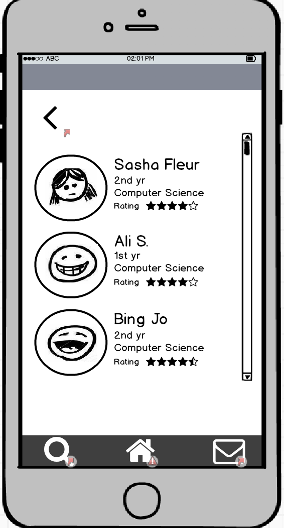
During the second set of interviews, the participants suggested adding a rating to the display of the users in the search results. This is an additional feature, which allows users to get an understanding of other users before adding them to their study buddies list. The rating system functions by allowing study buddies to rate each other based off of their study experiences together. The search results screen with the rating is shown below.
Before and after:
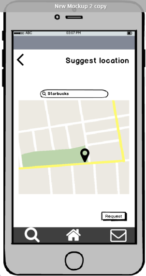
Location feature allows users to select a location when booking a study session. This is an important feature as it lessens the amount a user has to do when reviewing a booking session. The user getting the booking request may also suggest location, which helps both sides in deciding where to go with a click of a button.
Before and after:

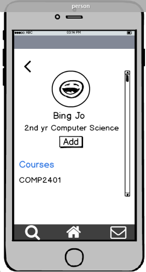
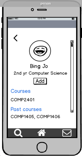
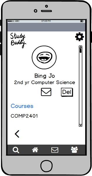
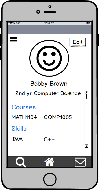
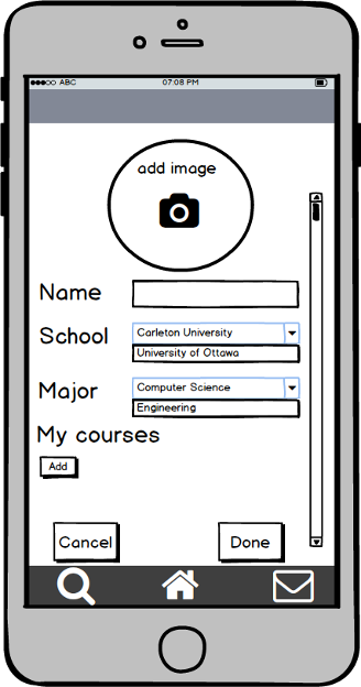
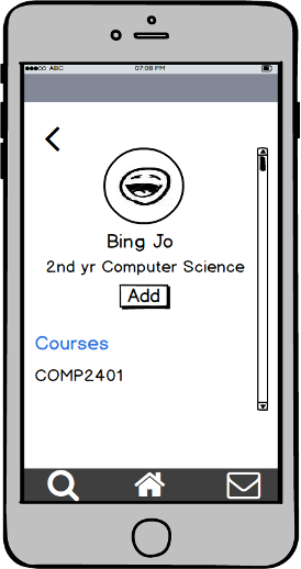
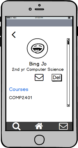
Added past courses to the profile page of selected user. This helps you get an understanding of the experience a user has and if they would be able to answer certain questions about a course. One user may have taken a course you are currently taking and vice versa, opens up opportunity to study for different topics.
Lastly, consistent design of each screen was used. The blue color on search screen representing the pressed button, was replaced with a light gray button. Other things to consider for the future include adding a press down functionality to be able to share through the pop up instead of having to go through the note page and share through that, even having a select option to select multiple note files and have them be sharable all at once.
Before and after: